How to make an aesthetic bio page: effects, music, and cursors
A step-by-step walkthrough for building an aesthetic link-in-bio page: layout, background effects, a music player, a custom cursor, and the small touches that make it feel designed.

August 10, 2026 · 3 min read
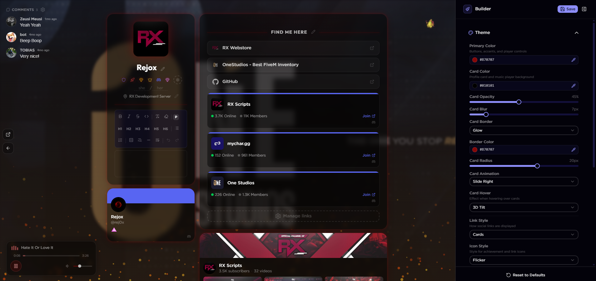
To make an aesthetic bio page, start with a layout, set a background and one animated effect, add a music player and a custom cursor, then tidy the fonts and colors so everything matches. On mychar.gg you do all of this in a live editor and see each change as you make it. Here is the order we recommend, with the choices that matter at each step.
1. Pick a layout first
The layout decides how your links, avatar, and sections are arranged, so choose it before styling anything. Try one or two and keep the one that fits the amount of content you have. A page with a few links wants a different layout than one with clips, a music player, and a game library. 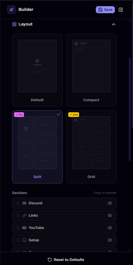
2. Set the background, then add one effect
Upload a background image or use a color, then add a single animated background effect on top. One effect looks intentional; three fight each other. Match the effect to the mood: subtle motion for a clean look, something bolder for a gaming page. Preview it on both desktop and mobile before moving on. 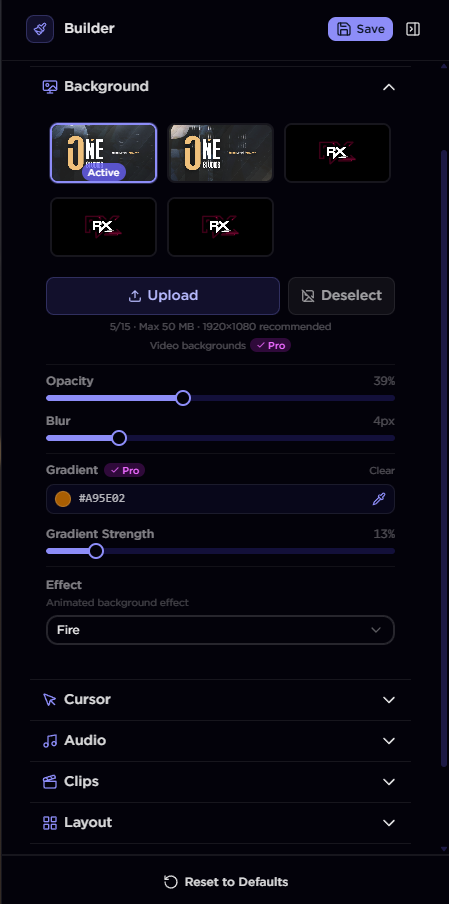
3. Add a music player
A short loop or a track that suits the page adds a lot for very little effort. Add your audio in the music player and keep the volume sensible, since visitors arrive with sound on. Use one default track rather than a long playlist, and make the player easy to pause. 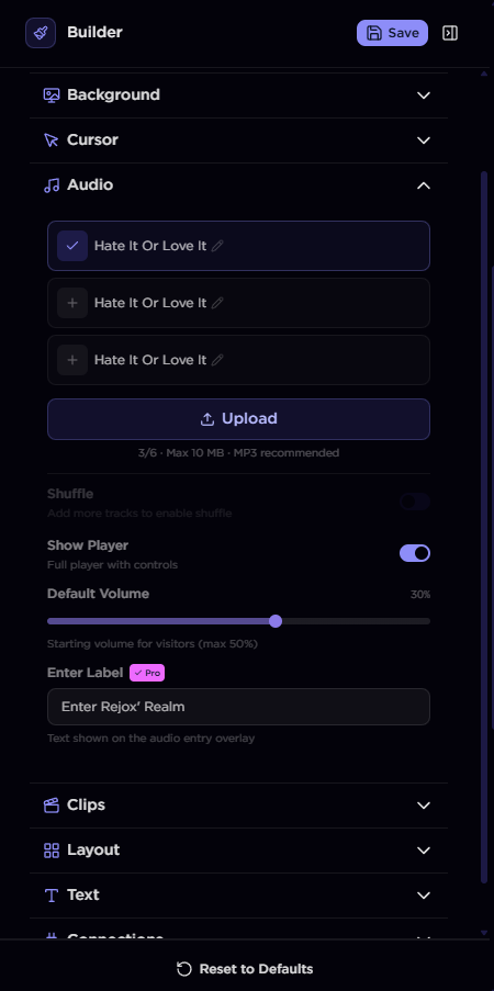
4. Choose a cursor
A custom cursor or a cursor trail is a small detail that people notice. Pick one that reads clearly against your background and does not distract from the links. This is the kind of touch that separates a designed page from a default one. 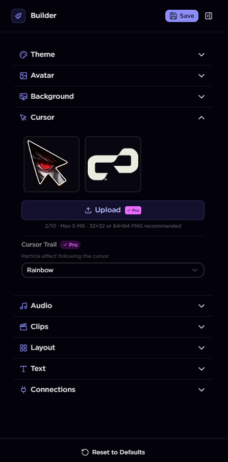
5. Finish with fonts and colors
Now make it consistent. Pick a font that matches the tone, set your accent color, and check that text stays readable over the background. If contrast is low, darken the background or add an overlay. Small, consistent choices here are what make the page feel finished.
6. Check it on mobile
Most visitors will open your link on a phone. Preview the mobile view, confirm the background effect still looks right at that size, and make sure links are easy to tap. Publish only after the mobile view looks as good as the desktop one.
A few taste rules
- One background effect, not several.
- Two fonts at most.
- Enough contrast that every link is easy to read.
- Lead with the content you most want people to see.
Where to go next
The getting-started guide covers account setup and your first links. If you are building for a specific audience, the guides for creators and artists point to the features each tends to use. When you are ready, create your page and build the first version in a few minutes. Effects, the music player, and custom cursors are part of the paid plans, and you can compare them on the pricing page.
Keep reading
The best bio link setup for Twitch streamers
How to set up a link-in-bio page that actually helps your stream: your Twitch and Discord front and center, clips on the page, and a schedule people can find.
September 15, 2026
How to add music to your link-in-bio page
A short guide to adding background music to your link-in-bio page: uploading a track, setting it up in the music player, and the etiquette that keeps visitors from muting you.
September 13, 2026
The most customizable link-in-bio tools in 2026, compared
A side-by-side look at the link-in-bio tools you can actually design in 2026, from deep-customization pages to simple link lists, and how to pick one.
July 21, 2026